Eira — Premium Cosmetic Theme
A complete reference for every setting, section, and feature in the Eira Shopify theme. Built for beauty and skincare brands who care about design, performance, and conversion.
Install & Launch Eira
Follow these five steps to install the theme, import demo content, complete first-time setup, connect required apps, and go live.
Step 1 — Install the Theme
- 1Purchase and download Eira from the Shopify Theme Store or your purchase receipt.
- 2In Shopify Admin, go to Online Store → Themes.
- 3Click Add theme → Upload zip file and upload the downloaded
.zipfile. - 4Once uploaded, click Customize to begin setup, or Publish to make it your live theme.
Step 2 — Import Demo Content (Optional)
Eira includes a demo content importer that sets up sample pages, navigation menus, and sections to match the theme preview.
- 1In the Theme Editor, click Actions → Import demo content.
- 2Select the demo preset that matches your store style.
- 3Click Import — existing content is not overwritten.
Step 3 — First-Time Setup Checklist
Complete these steps in the Theme Editor (Online Store → Themes → Customize):
- Upload your logo — Theme Settings → Header → Logo
- Set brand colours — Theme Settings → Colors → Brand palette
- Set typography — Theme Settings → Typography
- Configure header — layout, sticky behaviour, transparent header
- Build your navigation menus — Shopify Admin → Navigation
- Set up the footer — columns, newsletter, social links, payment icons
- Configure the announcement bar — promo messages and countdown
- Set up the cart — Drawer or Page mode, free shipping threshold
- Add Homepage sections — Hero Banner, Featured Products, Testimonials
- Enable Quick View & Wishlists — Theme Settings → Product Cards
- Configure product page — tabs, size guide, trust badges
- Set up collection filters — install Search & Discovery app first
- Add social media links — Theme Settings → Social Media
- Set favicon — Theme Settings → Favicon
- Test on mobile — use the mobile preview in the Theme Editor
Step 4 — Connect Required Apps
| Feature | App Required |
|---|---|
| Collection filters by tag/metafield | Shopify Search & Discovery (free) |
| Product reviews & star ratings | Shopify Product Reviews or Judge.me |
| Email newsletter signup | Klaviyo, Mailchimp, or Shopify Email |
| Wishlist | Swym Wishlist Plus or Growave |
Step 5 — Go Live
- 1Remove the password page — Shopify Admin → Online Store → Preferences → uncheck password protection.
- 2Connect your custom domain — Settings → Domains.
- 3Set up payment methods — Settings → Payments.
- 4Enable shipping rates — Settings → Shipping and delivery.
- 5Test a complete purchase using Shopify's Bogus Gateway test payment method.
Theme Settings
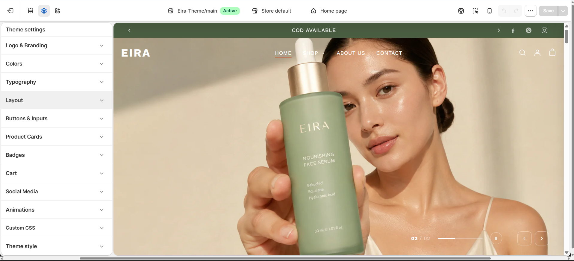
Theme Settings control global design across your entire store — colors, typography, buttons, product cards, animations, and more. Access via Theme Editor → Theme Settings (paintbrush icon).
Colors
Eira uses Color Schemes — up to 6 pre-defined background + text + button color combinations. Changing a scheme instantly updates every section assigned to it.
| Setting | What it does |
|---|---|
| Scheme 1–6 | Edit background, text, button, and link colors for each scheme |
| Primary Button | Background and text color for solid CTA buttons |
| Secondary Button | Border and text color for outline-style buttons |
Typography
| Setting | What it does |
|---|---|
| Heading Font | Typeface used for all H1–H4 headings across the store |
| Body Font | Typeface used for paragraphs, labels, and navigation |
| Heading Size Scale | A multiplier that makes all headings larger or smaller globally |
| Body Size | Base font size for body text (px) |
| Heading Italic | When on, headings are styled in italic — a signature Eira aesthetic |
| Letter Spacing | Adjusts tracking on headings (useful for uppercase heading styles) |
Buttons
| Setting | What it does |
|---|---|
| Border Radius | How rounded button corners are (0px = square, 50px = pill) |
| Button Style | Filled (solid) or Outlined (border only) for secondary buttons |
Product Cards
| Setting | What it does |
|---|---|
| Image Ratio | Square, Portrait (3:4), or Natural (original ratio) |
| Show Second Image on Hover | Swaps to the second product image on hover |
| Show Quick Add | Add to Cart button appears on card hover |
| Show Vendor | Displays the product's brand/vendor name on the card |
| Show Rating | Shows star rating (requires compatible reviews app) |
| Sale Badge Style | Text (Sale), Percentage (–20%), or Amount (–$10) |
Cart
| Setting | What it does |
|---|---|
| Cart Type | Drawer (slide-out panel), Page (dedicated cart page), or Popup |
| Enable Cart Note | Lets customers leave an order note from the cart |
Social Media
Fill in your social media profile URLs here — used across the theme wherever social icons appear (footer, announcement bar, mobile menu).
| Platform | Field |
|---|---|
instagram_link | |
| TikTok | tiktok_link |
facebook_link | |
pinterest_link | |
| YouTube | youtube_link |
| Twitter / X | twitter_link |
Animations
| Setting | What it does |
|---|---|
| Enable Animations | Global toggle for all scroll-triggered entrance animations |
| Animation Style | Fade Up, Fade In, or Slide In |
Favicon
Upload your store's favicon under Theme Settings → Favicon. Use a square PNG or SVG, minimum 32×32px. A 512×512px file is recommended.
Customisation Guide
Custom CSS, Custom Liquid, section limits, metafields, and color swatch configuration — for merchants and developers who need to go beyond the Theme Editor.
Custom CSS
Eira provides a Custom CSS input in the Theme Editor for adding CSS overrides without editing theme files.
- 1Go to Online Store → Themes → Customize.
- 2Click Theme settings (bottom of the left panel).
- 3Scroll to Custom CSS and paste your CSS rules.
Eira exposes CSS custom properties for consistent overrides:
:root {
  --color-brand: #D4A0A0;   /* primary brand colour */
  --color-accent: #8B4B6B;  /* accent / button colour */
  --font-heading: 'Cormorant Garamond', serif;
}
!important sparingly — it makes future maintenance harder. Always test on mobile after adding CSS.Custom Liquid (Additional Scripts)
For adding JavaScript or Liquid that runs on every page, go to Theme Settings → Custom code and use the Header or Footer script fields. For complex edits, use Edit code (Online Store → Themes → Actions → Edit code).
Section Limits
Shopify enforces a limit of 25 sections per template. Blocks within a section have a separate limit — typically 16–50 blocks depending on the section type.
Metafields
Metafields let you attach custom data to products, collections, customers, and orders — then display that data in your theme.
- 1Go to Shopify Admin → Settings → Custom data.
- 2Select the resource (Products, Collections, etc.) and click Add definition.
- 3Set name, namespace, key, and type — then add values to individual products/collections.
Common cosmetic use cases for Eira's Product metafield blocks:
| Metafield Key | Display Use |
|---|---|
product.metafields.custom.skin_type | Best for: Dry, Oily, Combination |
product.metafields.custom.key_ingredients | Ingredient callouts |
product.metafields.custom.how_to_use | Step-by-step usage instructions |
Color Swatches Configuration
Colour swatches are generated automatically from variant option values. To control which option names trigger swatch rendering:
- 1Go to Theme Settings → Product → Swatch option names.
- 2Enter a comma-separated list of option names, e.g.
Color, Colour, Shade, Finish. - 3Upload swatch images to Settings → Files — name each file exactly after the variant value (e.g.
rose-gold.png).
Navigation Menus
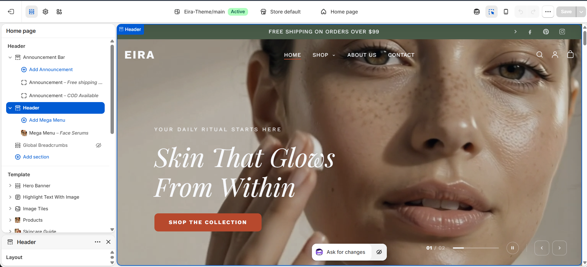
Eira's header supports a full desktop navigation bar, a mobile slide-in drawer menu, and a predictive search drawer. Navigation is controlled from Shopify Admin → Navigation and Theme Editor → Header.
Building Menus in Shopify Admin
Build your menus at Shopify Admin → Online Store → Navigation. Eira reads Shopify menus directly and supports three levels deep:
Top-level link (e.g. "Shop")        ← appears in the header nav bar
  ├─ Child link (e.g. "Serums")     ← appears in dropdown or mega menu columns
  ├─ Child link (e.g. "Moisturisers")
  └─ Child group (e.g. "By Skin Type")
       ├─ Grandchild (e.g. "Dry Skin")  ← sub-links in mega menu columns
       └─ Grandchild (e.g. "Oily Skin")
Header Section Settings
Layout
| Setting | What it does |
|---|---|
| Menu Style | Position of logo relative to navigation links |
| Sticky Header | Header stays fixed as the customer scrolls |
| Transparent Header on Homepage | Header background transparent on homepage only |
| Glass Effect | Frosted-glass blur behind the transparent header |
| Transparent Header Text Color | Icon/link color when header is transparent |
| Sticky Background Color | Solid background color the header transitions to after scrolling |
Desktop Navigation Behaviour
| Menu Item Type | Renders As |
|---|---|
| Simple links (no children) | Plain text links in the nav bar |
| Links with children (no mega menu block) | Standard dropdown on hover |
| Links with a Mega Menu block attached | Full-width mega menu panel on hover or keyboard focus |
Mobile Menu Drawer
On screens narrower than 1024px, the desktop nav is replaced by a hamburger button (☰). Features of the mobile drawer:
- All top-level links listed vertically
- Links with children show an accordion toggle — tap to expand
- Mega Menu Promo Images appear at top of expanded accordion
- Sign In link and social media icons at the bottom
- Swipe left to close, or press Escape
- Focus trap keeps keyboard navigation inside the drawer
Predictive Search Drawer
The search drawer opens when the search icon is tapped. Results appear live as the customer types, showing: products (with image, title, price), blog articles, pages, and popular search terms before typing starts.
Mega Menus
Mega menus are large dropdown panels that open from top-level navigation items. Eira supports 3 layouts, each configured as a block inside the Header section.
How Mega Menus Work
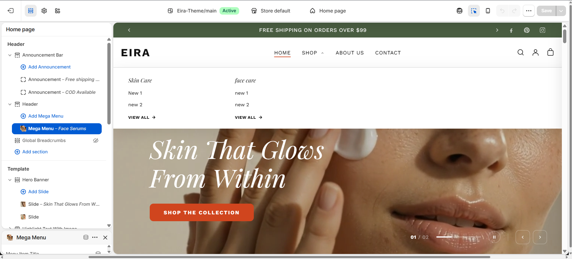
Mega menus are powered by two things: (1) a Shopify menu item with children, and (2) a Mega Menu block in the Header section linked by matching its title. When both exist and the title matches, Eira replaces the standard dropdown with the rich mega menu panel.
Setting Up — Step by Step
- 1Go to Shopify Admin → Navigation → Main Menu and add child links under a top-level item.
- 2In the Theme Editor → Header, click Add block → Mega Menu.
- 3In Menu Item Title, type the exact name of your top-level link (case-insensitive), e.g.
Shop. - 4Choose a layout and fill in the layout-specific settings.
Layout 1: Columns + Products
Navigation links as columns on the left, product cards from a collection on the right. Product cards show image, title, price, and an AJAX Add to Cart button.
| Setting | What it does |
|---|---|
| Menu Item Title | Matches this block to a top-level nav link |
| Products Collection | Collection to pull product cards from (up to 4) |
| Featured Product | Pin one specific product as the first card |
| Products to Show | How many product cards to display (1–4) |
Layout 2: Columns + Promo Image
Navigation columns on the left, a promotional image card with title, subtitle, and button on the right. The Promo Image also appears at the top of the mobile accordion for that nav item.
| Setting | What it does |
|---|---|
| Promo Image | The promotional photo shown on the right side |
| Promo Title | Bold text over/below the promo image |
| Promo Subtitle | Supporting text |
| Promo Button Label | CTA text, e.g. Shop Now |
| Promo Button Link | Where the button links |
Layout 3: Collection Cards
Child menu links displayed as visual collection image cards. Each collection must point to a Collection page for its image to load.
| Setting | What it does |
|---|---|
| Cards Per Row | How many collection cards show in a row (2–5) |
| Show Product Count | Displays the number of products under each card |
Interaction Behaviour
| Trigger | What happens |
|---|---|
| Mouse hover over nav item | Mega menu opens after 150ms delay |
| Mouse leaves nav item or panel | Mega menu closes after 150ms delay |
| Keyboard: Arrow Down on trigger | Opens the mega menu, moves focus into panel |
| Keyboard: Escape inside panel | Closes the mega menu, returns focus to trigger |
| Click outside the header | Closes all open mega menus |
Cart Drawer
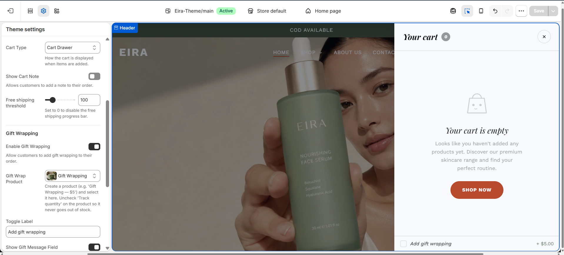
The Cart Drawer is a slide-in panel that opens when a customer clicks the cart icon. It's the recommended cart mode for Eira — customers review items and checkout without leaving the current page.
Enabling the Cart Drawer
- 1Go to Theme Editor → Theme Settings (paintbrush icon).
- 2Open the Cart group.
- 3Set Cart Type to Drawer.
Cart Drawer Settings
| Setting | What it does |
|---|---|
| Cart Type | Drawer (recommended), Page, or Popup |
| Show Cart Recommendations | Shows a "You may also like" strip at the bottom |
| Recommendations Source | Automatic (Shopify AI) or a specific collection |
| Show Free Shipping Progress Bar | Shows progress bar toward free shipping threshold |
| Free Shipping Threshold | Cart total at which free shipping unlocks |
| Show Order Note | Adds a text field for personalisation/gift notes |
Pro Tips
- Always use Cart Drawer mode — it keeps customers on the page and reduces drop-off.
- Enable the Free Shipping Progress Bar if you offer free shipping at any threshold — it consistently increases average order value.
- Use Order Note if you offer personalisation or gift wrapping.
- Keep Cart Recommendations on — customers in purchase mode are likely to add impulse items.
Quick View
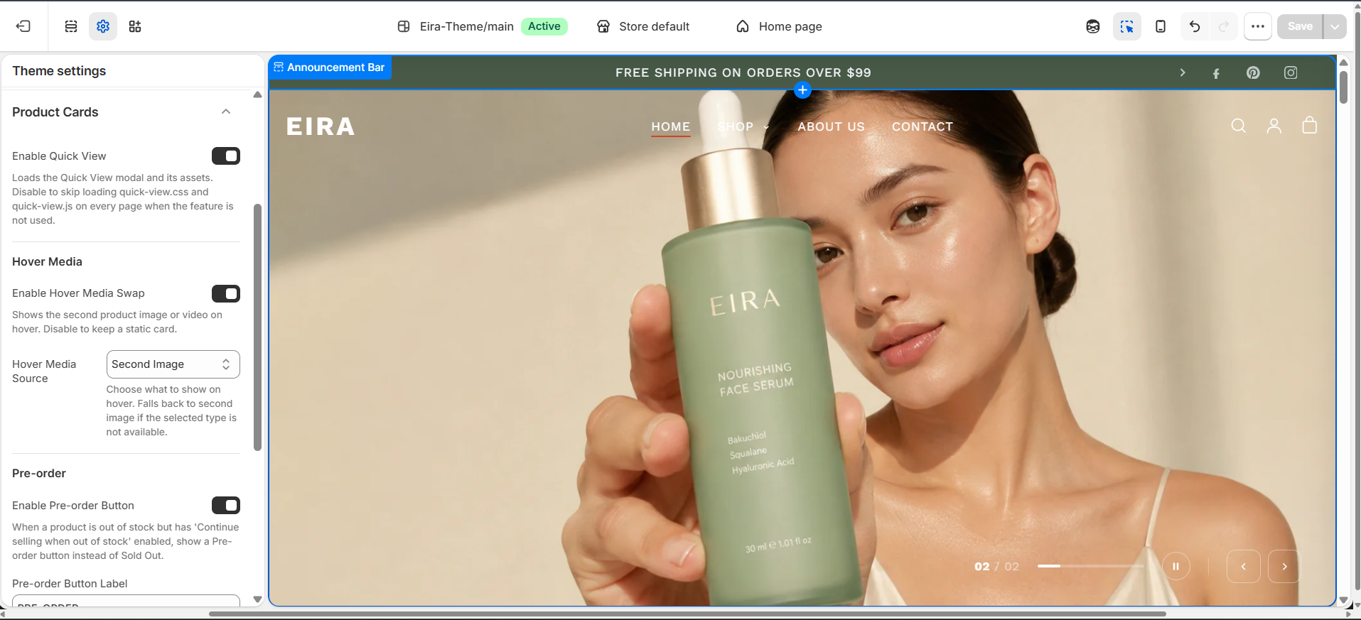
Quick View is a modal overlay letting customers preview full product details — images, variants, description, and Add to Cart — without leaving the current page. Opens from product cards across all pages.
How to Enable
- 1Go to Online Store → Themes → Customize.
- 2Open Theme Settings → Product Cards.
- 3Toggle Enable Quick View to ON.
Quick View Modal Contents
| Element | Details |
|---|---|
| Product Images | Full gallery with thumbnail strip — swipeable on mobile |
| Title & Price | Live price update when variant changes |
| Variant Selectors | Colour swatches + dropdown selectors |
| Quantity Selector | Increment/decrement with min/max guard |
| Add to Cart | AJAX add — confirms with toast, updates cart count badge |
| View Full Details | Link to the full product page |
| Short Description | First paragraph of product description (configurable) |
Behaviour
Modal opens with a smooth fade + scale animation. Closing: click ✕, click outside, or press Escape. Focus is trapped inside the modal (WCAG 2.1 AA compliant). On mobile, the modal slides up as a bottom sheet. Quick View content is fetched via the Section Rendering API on demand — zero performance cost until triggered.
Customer Accounts
Eira supports both Classic customer accounts and Shopify's newer New customer accounts.
Classic vs New
| Feature | Classic | New |
|---|---|---|
| Login method | Email + Password | Magic link or Google/Apple SSO |
| Registration | Manual form | Auto-created on first login |
| Theme customisation | Full — uses Eira's sections | Limited — Shopify-hosted |
| Requires password | Yes | No — passwordless |
Classic Account Pages
| Page | URL |
|---|---|
| Login | /account/login |
| Register | /account/register |
| Account Dashboard | /account |
| Order Detail | /account/orders/{id} |
| Addresses | /account/addresses |
Recommended Apps
Eira works beautifully out of the box, but these apps unlock additional features and are verified to integrate cleanly with the theme.
Free Apps (Official Shopify)
| App | Purpose |
|---|---|
| Shopify Search & Discovery | Collection filters, search synonyms, product boosts |
| Shopify Product Reviews | Star ratings on product pages and cards |
| Shopify Email | Email campaigns from Shopify Admin |
| Shopify Forms | Custom forms on pages |
Reviews & UGC
| App | Notes |
|---|---|
| Judge.me | Most popular; renders star ratings in Eira natively |
| Okendo | Premium reviews with photo/video UGC; ideal for cosmetic brands |
| Loox | Photo review carousels; great for visual social proof |
Email & SMS Marketing
| App | Notes |
|---|---|
| Klaviyo | Industry standard for beauty brands; Eira newsletter section integrates natively |
| Omnisend | Good budget alternative to Klaviyo |
| Postscript | SMS marketing |
Wishlist & Loyalty
| App | Notes |
|---|---|
| Swym Wishlist Plus | Heart icon integrates with Eira product cards |
| Growave | All-in-one: wishlist, loyalty, reviews, Instagram |
| Smile.io | Best-in-class loyalty and rewards program |
Announcement Bar
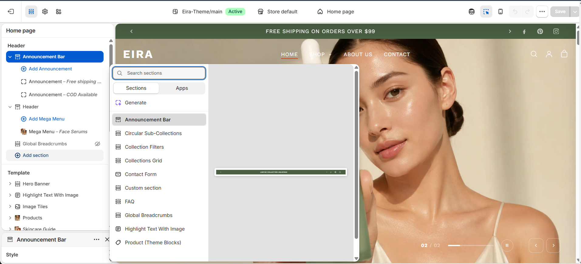
The thin strip above your header, visible on every page. Rotate up to 5 different messages automatically. Found at: Theme Editor → Announcement Bar.
Settings
| Setting | What it does |
|---|---|
| Color Scheme | Background and text color of the bar |
| Bar Height | How tall the bar is in pixels |
| Autoplay Speed | Seconds each message shows before the next slides in |
| Show Social Icons | Shows social media icons on the right side of the bar |
| Show Language / Currency | Shows language and currency selector for international stores |
Announcement Blocks
| Field | What to enter |
|---|---|
| Message | The text in the bar, e.g. Free shipping on orders over $75 |
| Button Text | Optional clickable button, e.g. Shop Now |
| Button Link | Where the button links |
Header
The header appears on every page. It holds your logo, navigation menu, search, account, and cart icons. Found at: Theme Editor → Header.
Layout
| Setting | What it does |
|---|---|
| Menu Style | Logo Left, Logo Center, or Logo Right |
| Enable Sticky Header | Header stays fixed at the top as customers scroll |
| Transparent Header on Homepage | Header overlays hero image with no background on homepage only |
Logo
| Setting | What it does |
|---|---|
| Logo Image | Upload your store logo. Empty = store name as text |
| Logo Width — Desktop | How wide your logo renders on desktop |
| Logo Width — Mobile | How wide your logo renders on phones |
Search
| Setting | What it does |
|---|---|
| Search Placeholder Text | Hint text inside the search input box |
| Popular Search Terms | Comma-separated terms shown as quick-tap shortcuts |
| Header Height | How tall the header bar is |
Hero Banner
The large full-screen section at the top of your homepage. Have a single slide or up to 6 slides with background image, video, text, and CTA buttons. Found at: Theme Editor → Hero Slider.
Banner Settings
| Setting | What it does |
|---|---|
| Banner Height | Height as % of screen. 100 = full screen, 50 = half screen |
| Auto-rotate Slides | Automatically cycles through slides |
| Slide Duration | Seconds each slide shows before moving to next |
Slide Block Fields
| Field | What to enter |
|---|---|
| Background Video | Upload an MP4 file — plays silently on loop. Add poster image as mobile fallback |
| Background Image | Main photo that fills the slide (also used as video poster/fallback) |
| Mobile Image | Portrait-format image for phones. Highly recommended |
| Overlay Opacity | Dark layer over image for text readability (0–90%). Start with 15–40% |
| Subtitle | Small text above the main heading |
| Heading | Main large headline — keep to 4–6 words for hero impact |
| Button Label | CTA text, e.g. Shop Now |
| Button Link | Where the button takes the customer |
| Text Color | Color of subtitle, heading, and button on this slide |
| Horizontal / Vertical Position | Where text sits on desktop and mobile |
Products Section
A scrollable row or grid of product cards. Highlight best sellers, new arrivals, or any collection. Add collection tabs for customers to filter between categories without leaving the page.
Content Settings
| Setting | What it does |
|---|---|
| Section Heading | Title above the products, e.g. Best Sellers |
| Italicize Heading | Makes heading italic for an editorial look |
| Collection | Collection to pull products from (used without Collection Tab blocks) |
| Products to Show | How many products to display (2–12) |
| Desktop Columns | 2, 3, or 4 columns on desktop. Mobile always 1 per row |
Collection Tab Blocks
Add up to 6 Collection Tab blocks. Each tab shows a different set of products. When at least one tab is added, an All tab appears first automatically.
| Field | What to fill in |
|---|---|
| Collection | The collection whose products appear when this tab is selected |
| Tab Label | Text shown on the tab button. Blank = uses collection title |
| Products to Show | How many products to show under this tab (2–12) |
Trending Products
A curated product grid with rich interactive product cards — swatches, quick-add, wishlist, and badges — designed for high conversion on cosmetic storefronts.
Section Settings
| Setting | Description |
|---|---|
| Heading / Subheading | Section title and optional supporting text |
| Layout | Grid or Carousel (horizontal scroll on mobile) |
| Columns Desktop / Mobile | 2–5 desktop, 1–2 mobile |
| Products Source | Collection-based or manually picked |
| Product limit | Max products shown (4–20) |
| Enable Quick View | Opens Quick View modal on card hover/tap |
| Enable Wishlist | Heart icon toggle on each card |
| Image ratio | Portrait (4:5), Square (1:1), or Landscape (16:9) |
| Show second image on hover | Swaps to alt image when cursor hovers (desktop) |
Product Card Features
- Colour Swatches — Clicking a swatch swaps the card image without a page reload
- Quick Add — Adds the default variant to cart via AJAX with a toast confirmation
- Sale Badge — Automatically displays when a compare-at price is set
- New Badge — Displays on products published within the last 30 days
- Low Stock Badge — Appears when inventory drops below the configured threshold
- Wishlist Button — Heart icon saves the product (requires compatible app)
Collection List
A grid of collection cards — each showing the collection's image, name, and optional product count. Use on your homepage or a dedicated categories page. Found at: Theme Editor → Add section → Collection List.
| Setting | What it does |
|---|---|
| Section Heading | Title above the cards, e.g. Shop by Category |
| Collections | Choose which collections to display |
| Show Product Count | Number of products under each collection card |
| Columns (Desktop) | Cards per row on desktop |
| Card Style | Overlaid — name on image; Below — name under image |
| Image Ratio | Square, Portrait (3:4), or Landscape (4:3) |
Testimonials
Customer reviews or quotes in a scrollable carousel. Build trust and social proof anywhere on your store. Found at: Theme Editor → Add section → Testimonials.
| Field | What to fill in |
|---|---|
| Quote | The customer's review text |
| Customer Name | Reviewer's name, e.g. Sarah M. |
| Customer Title / Location | Optional context, e.g. Verified Buyer or London, UK |
| Star Rating | Select 1–5 stars |
| Customer Photo | Small avatar or portrait of the reviewer |
Tips
- Use real customer language — genuine-sounding testimonials convert better.
- Include first name and last initial (Sarah M.) for credibility without exposing full details.
- Add at least 6 testimonials so the carousel feels varied.
- Prioritise reviews mentioning a specific result over vague praise.
Newsletter
A dedicated email signup panel. Capture subscribers with a discount code, early access, or skin tips. Found at: Theme Editor → Add section → Newsletter.
| Setting | What it does |
|---|---|
| Section Heading | Main headline, e.g. Get 10% Off Your First Order |
| Subtext | Supporting description |
| Button Label | Submit button text, e.g. Subscribe or Claim My Discount |
| Success Message | Text shown after a successful signup |
| Show Name Field | Adds a first name field next to the email input |
| Background Image | Optional full-width background photo |
Sale Banner
A bold, high-impact promotional section for limited-time sales. Features a countdown timer, headline, offer details, and CTA button. Found at: Theme Editor → Add section → Sale Banner.
| Setting | What it does |
|---|---|
| Badge / Tag Text | Small label above heading, e.g. Limited Time or Flash Sale |
| Heading | Main offer headline, e.g. Up to 40% Off Sitewide |
| Enable Countdown | Shows a live countdown timer |
| End Date & Time | When the countdown reaches zero |
| Expired Message | Text shown after countdown reaches zero |
| Background Image | Full-width photo behind the banner content |
Brand Features
Highlight key selling points: Clean Ingredients, Dermatologist Tested, Cruelty Free, Sustainable Packaging. Each feature shows an icon, heading, and short description. Found at: Theme Editor → Add section → Brand Features.
| Feature Block Field | What to fill in |
|---|---|
| Icon / Image | Upload a small PNG icon or illustration (SVG works best for crispness) |
| Heading | The feature name, e.g. Cruelty Free |
| Description | 1–2 sentences expanding on the feature |
Before & After
An interactive drag-slider comparison of two images — perfect for demonstrating skincare results. Customers drag a handle left or right to reveal more of each image. Found at: Theme Editor → Add section → Before & After.
| Setting | What it does |
|---|---|
| Before Image | The "before" photo (left side) |
| After Image | The "after" photo (right side) |
| Before Label | Text shown over the before image |
| After Label | Text shown over the after image |
| Initial Handle Position | Where the drag handle starts (0–100%). 50 = centered |
Product Page
Where customers make their purchase decision. Shows images, title, price, variant selector, Add to Cart button, description, and customisable content blocks. Found at: Theme Editor → Products → Default Product.
Media Settings
| Setting | What it does |
|---|---|
| Media Layout | Stacked / Thumbnails / Sticky |
| Enable Image Zoom | Customers can click/tap to zoom in |
| Enable Video Autoplay | Product videos autoplay when in view (muted) |
Product Info Blocks
| Block | What it adds |
|---|---|
| Title | Product name |
| Price | Sale price, compare-at price, and Tax included text |
| Variant Picker | Color swatches / size buttons / dropdowns |
| Quantity + ATC | Quantity selector and Add to Cart button |
| Buy Now | Dynamic checkout (Shop Pay, PayPal, etc.) |
| Description | Product description from Shopify Admin |
| Collapsible Tab | Expandable panel — great for ingredients, how to use, shipping |
| Rating | Star rating (requires compatible reviews app) |
| Custom Liquid | HTML or app embed code |
Product Star
A showcase section that highlights a single hero product with large imagery, key benefits, and a direct Add to Cart button. Ideal for featuring your best seller or a new launch. Found at: Theme Editor → Products → Add section → Product Star.
Settings
| Setting | What it does |
|---|---|
| Product | Select the product to feature |
| Section Heading | Optional heading above the product, e.g. Our #1 Best Seller |
| Layout | Image Left / Image Right — positions the product image relative to info |
| Image Style | Standard, Rounded, or Full Bleed |
| Show Price | Displays price and compare-at price |
| Show Variant Picker | Lets customers select a variant directly in this section |
| Show Add to Cart | Inline Add to Cart button |
| Color Scheme | Background and text color for the section |
Benefit Blocks
Add up to 4 benefit/feature blocks that appear alongside the product:
| Field | What to fill in |
|---|---|
| Icon / Image | Small icon representing the benefit |
| Benefit Text | Short description, e.g. Clinically proven to reduce wrinkles by 40% |
Product Recommendations
Automatically generated "You May Also Like" product suggestions displayed below the main product. Powered by Shopify's Recommendations API for personalised, AI-driven suggestions. Found at: Theme Editor → Products → Add section → Product Recommendations.
Settings
| Setting | What it does |
|---|---|
| Section Heading | Title, e.g. You May Also Like or Complete Your Routine |
| Products to Show | Maximum number of recommended products (2–10) |
| Columns (Desktop) | Products per row on desktop (2–5) |
| Layout | Grid or Carousel (horizontal scroll) |
| Fallback Collection | Collection to pull from if Shopify has no AI recommendations yet |
| Color Scheme | Background and text color for the section |
Collection Page
Shows all products in a specific collection. Customers can filter, sort, and switch between grid and list view. Found at: Theme Editor → Collections → Default Collection.
| Setting | What it does |
|---|---|
| Products Per Page | How many products load per page (or before Load More) |
| Enable Infinite Scroll | Automatically loads more products as the customer scrolls |
| Show Collection Description | Displays the collection's description text above the product grid |
| Default Grid Columns | Product columns side by side on desktop |
| Show Grid/List Toggle | Lets customers switch between grid and list view |
| Show Sort By | Shows a Sort By dropdown |
Collection Filters
Powers the filter and sort sidebar on collection and search results pages. Uses Shopify's native Storefront Filtering API and requires the Search & Discovery app for custom filters.
Filter Types Supported
| Filter Type | How It Works |
|---|---|
| List | Checkbox list — multiple values selectable |
| Swatch | Colour/pattern swatches generated from variant option values |
| Price Range | Dual-handle slider with min/max inputs |
| Boolean | Single toggle, e.g. In Stock Only |
Key Settings
| Setting | Description |
|---|---|
| Filter layout | Sidebar (desktop left panel) or Drawer (slide-in panel) |
| Show filter count | Displays matching products next to each filter value |
| Pagination style | Classic pages, infinite scroll, or Load More button |
| Show active filters | Pill-shaped active filter tags at top with ✕ to remove |
All Collections
The collections listing page showing every collection in your store as a grid of cards. URL: /collections. Found at: Theme Editor → Collection list → All Collections.
Settings
| Setting | What it does |
|---|---|
| Page Heading | Title at the top of the page, e.g. Our Collections or Shop by Category |
| Collections Per Row (Desktop) | Cards per row on desktop (2–5) |
| Image Ratio | Square, Portrait (3:4), or Landscape (4:3) |
| Card Style | Overlaid — title on image; Below — title under image |
| Show Product Count | Number of products displayed under each collection name |
| Sort Order | Alphabetical, Date Created, or Manual (as set in Shopify Admin) |
Quick View Section
A dedicated section-level Quick View configuration for embedding quick-view-enabled product grids on any page. Unlike the global Quick View feature (Theme Settings), this section lets you add a Quick View product showcase to specific templates. Found at: Theme Editor → Add section → Quick View Section.
Settings
| Setting | What it does |
|---|---|
| Section Heading | Title above the products, e.g. Quick Shop |
| Collection | Collection to pull products from |
| Products to Show | How many products to display (2–12) |
| Columns (Desktop) | Products per row on desktop (2–5) |
| Enable Quick View | Toggle Quick View modal on product card click |
| Show Quick Add | Show Add to Cart button directly on cards |
| Color Scheme | Background and text color for the section |
Cart Page
The full-page cart showing the customer's current items, quantity controls, discount codes, and checkout. Found at: Theme Editor → Cart.
| Setting | What it does |
|---|---|
| Show Order Note | Adds an Order Note text field |
| Show Discount Code Field | Shows a discount code input |
| Show Shipping Estimate | Lets customers estimate shipping costs |
| Checkout Button Label | Custom text for the checkout button |
Search Page
Displays results when a customer performs a search — products, articles, and pages with filtering and sorting options. Found at: Theme Editor → Pages → Search.
| Setting | What it does |
|---|---|
| Results Per Page | How many results appear per page |
| Show Products | Include products in search results |
| Show Blog Articles | Include blog posts in search results |
| Show Pages | Include pages in search results |
| Show Product Filters | Shows filter options on product search results |
Blog Page (Article Listing)
Displays all articles in a selected blog as a grid of preview cards. Customers can filter articles by tag. Found at: Theme Editor → Blog Posts → Default Blog.
| Setting | What it does |
|---|---|
| Show Featured Image | Displays article thumbnail on each card |
| Articles Per Page | How many cards appear per page |
| Enable Infinite Scroll | Auto-loads more articles on scroll |
| Show Tag Filter | Tag list for filtering by topic |
| Filter Position | Sidebar or Top Bar |
| Columns (Desktop) | Article cards per row on desktop |
Blog Article
The layout for individual blog post pages. Renders article content, author, publish date, featured image, tags, social sharing, and related posts. Found at: Theme Editor → Blog Posts → Default Article.
| Setting | What it does |
|---|---|
| Show Featured Image | Full-width header image at top of post |
| Show Author | Author's name below the article title |
| Show Date | Publish date |
| Show Tags | Clickable tag chips that filter the blog |
| Show Social Share | Social sharing icons (Facebook, Twitter/X, Pinterest) |
| Show Related Articles | Article grid at the bottom of the post |
| Content Width | Width of the article text column. 680–720px optimal for reading |
Contact Page
A contact form with optional contact details (email, phone, address) and an embedded Google Map. Found at: Theme Editor → Pages → Contact.
| Setting | What it does |
|---|---|
| Layout | Form Only / Form + Info / Full Width Form |
| Show Name Field | Adds a Name input to the form |
| Show Phone Field | Adds an optional Phone Number input |
| Submit Button Label | Text on the submit button |
| Show Map | Embeds a Google Map of your address |
About Us Page
Full-featured layout for your brand's story page — hero banner, rich text + image, team/values grid, and brand stats. Found at: Theme Editor → Pages → About Us.
| Area | Key Settings |
|---|---|
| Hero Area | Hero Image, Hero Heading, Overlay Opacity, Hero Height |
| Brand Story | Story Heading, Story Text, Story Image, Image Position (Left / Right) |
| Stats / Numbers | Show Stats toggle; each stat is a block with Number/Value + Label |
| Values / Team Grid | Grid Heading, Columns (2–4); each card has Image, Name/Title, Description |
Content Page
The default template for standard Shopify pages — About, FAQ, Terms & Conditions, Privacy Policy, and any custom pages. Renders the page's rich text content with optional sidebar and additional sections. Found at: Theme Editor → Pages → Default Page.
Settings
| Setting | What it does |
|---|---|
| Content Width | Narrow (680px), Standard (800px), or Wide (1000px) |
| Show Page Title | Displays the page title as an H1 heading |
| Show Breadcrumb | Shows breadcrumb navigation above the page content |
| Text Alignment | Left, Center, or Right alignment for body text |
| Color Scheme | Background and text color |
Adding Sections to Pages
Since Eira is an OS 2.0 theme, you can add any section below the page content — product grids, testimonials, newsletter signup, or custom sections. Go to Theme Editor → Pages → Default Page and click Add section below the main content block.
Password Page
The storefront password page shown when your store is password-protected (before launch or during maintenance). Features your brand's logo, a custom message, password input, and optional newsletter signup. Found at: Theme Editor → Pages → Password.
Settings
| Setting | What it does |
|---|---|
| Background Image | Full-screen background photo for the password page |
| Logo | Your store logo (uses header logo if not set) |
| Heading | Main message, e.g. Coming Soon or We're Getting Ready |
| Subheading / Body Text | Supporting text with details or a launch date |
| Show Countdown | Displays a countdown timer to your launch date |
| Launch Date | Date and time for the countdown timer |
| Show Newsletter Signup | Email capture form for pre-launch subscribers |
| Newsletter Heading | Text above the email input, e.g. Be the first to know |
| Overlay Opacity | Darkens the background image for text readability (0–100%) |
Customer Account Dashboard
The My Account dashboard for logged-in customers. Shows recent orders, account details, and address management. URL: /account.
| Element | Description |
|---|---|
| Welcome message | Greets customer by first name |
| Recent Orders | Lists last 5 orders with status, date, and total |
| Manage Addresses | Link to the addresses management page |
| Account Details | Email address and name |
| Log out | Signs the customer out |
About (Brand Story Section)
A rich split-layout section — heading, body text, optional pull-quote, and an image. Ideal for a homepage brand introduction. Found at: Theme Editor → Add section → About.
| Setting | What it does |
|---|---|
| Section Heading | Main heading, e.g. Born from a love of clean beauty |
| Body Text | Your brand story paragraph(s) |
| Quote / Highlight | A short pull-quote in larger text |
| Image | Brand photo or founder portrait |
| Image Position | Left or Right of the text |
About Text
A clean, text-focused block for brand messaging — heading and body text only, centered or left-aligned. Found at: Theme Editor → Add section → About Text.
| Setting | What it does |
|---|---|
| Heading | Section title, e.g. Our Philosophy |
| Text | Body copy. Supports basic formatting |
| Text Alignment | Left, Center, or Right |
| Max Width | Maximum width of the text column |
Brand Logos (Press / As Seen In)
A row of logos for an "As Seen In" press strip or certifications. Found at: Theme Editor → Add section → Brand Logos.
| Setting | What it does |
|---|---|
| Section Heading | Label, e.g. As Seen In or Trusted By |
| Autoplay / Scroll | Auto-scrolls the logo row in a loop |
| Logo Height | How tall each logo renders |
| Greyscale | Makes all logos grey; coloured on hover |
Highlight Text
A large, bold statement — brand tagline, mission statement, or seasonal message. A powerful visual pause between content-heavy sections. Found at: Theme Editor → Add section → Highlight Text.
| Setting | What it does |
|---|---|
| Text | The large statement, e.g. Radiance you can see. Science you can trust. |
| Text Size | Small, Medium, Large, or Extra Large |
| Highlighted Words | Comma-separated words that receive a special color highlight |
| Animated Entry | Text animates in word-by-word on scroll into view |
Blog Posts
A preview grid of your latest blog articles. Drive traffic to your content and build authority. Found at: Theme Editor → Add section → Blog Posts.
| Setting | What it does |
|---|---|
| Blog | Choose which blog to pull articles from |
| Posts to Show | Number of article previews to display (2–6) |
| Show Excerpt | Shows the first few lines of the article |
| Columns (Desktop) | Article cards per row on desktop |
| Image Ratio | Landscape (16:9), Square, or Portrait |
Image Grid
A masonry or uniform grid of images — ingredients, lifestyle photography, lookbook, before/after results, or UGC. Found at: Theme Editor → Add section → Image Grid.
| Setting | What it does |
|---|---|
| Columns (Desktop) | Images per row (2–5) |
| Grid Style | Uniform — equal size; Masonry — varied heights |
| Image Ratio | Square, Portrait, or Landscape |
| Layout Width | Boxed, Fluid, or Full Width |
Instagram Feed
Displays your latest Instagram posts directly on your store. Requires connecting your Instagram Business account to Shopify. Found at: Theme Editor → Add section → Instagram.
| Setting | What it does |
|---|---|
| Section Heading | Title, e.g. Follow Us @eira.beauty |
| Instagram Handle | Your @username |
| Posts to Show | How many photos to display (4–12) |
| Columns (Desktop) | Photos per row |
Glow Set (Featured Set Section)
Showcases a curated skincare set or routine — group of products with combined pricing and a lifestyle image. Found at: Theme Editor → Add section → Glow Set.
| Setting | What it does |
|---|---|
| Section Heading / Subheading | e.g. The Glow Starter Kit / Everything you need for radiant skin |
| Description | About the set — what it includes and why it works together |
| Lifestyle Image | Styled photo of the set (flat-lay or model shot) |
| Product blocks | Add each product in the set; optional Custom Label per product (e.g. Step 1 — Cleanse) |
Shoppable Videos
Embed short-form videos with tagged products — customers can shop directly from the video. Perfect for tutorials, routines, and product demos. Found at: Theme Editor → Add section → Shoppable Videos.
Section Settings
| Setting | What it does |
|---|---|
| Section Heading | Title above the video grid, e.g. Shop the Look |
| Subheading | Optional supporting text below the heading |
| Layout | Grid or Carousel — controls how videos are displayed |
| Videos Per Row (Desktop) | How many videos show side by side on desktop (2–4) |
| Autoplay | Videos autoplay (muted) when scrolled into view |
| Color Scheme | Background and text color for the section |
Video Blocks
Each video block contains:
| Field | What to fill in |
|---|---|
| Video File / URL | Upload an MP4 or paste a YouTube/Vimeo URL |
| Cover Image | Thumbnail shown before the video plays |
| Tagged Product | Product linked to this video — appears as an overlay card |
| Caption | Short description or CTA text below the video |
Skincare Guide
An interactive skincare routine builder — guide customers through a step-by-step regimen with product recommendations for each step. Found at: Theme Editor → Add section → Skincare Guide.
Section Settings
| Setting | What it does |
|---|---|
| Section Heading | Title, e.g. Your Daily Skincare Routine |
| Subheading | Supporting text, e.g. Follow these steps for radiant skin |
| Layout Style | Steps (numbered vertical) or Tabs (horizontal switching) |
| Background Image | Optional lifestyle photo behind the guide |
| Color Scheme | Background and text color for the section |
Step Blocks
Add up to 8 step blocks. Each step represents one part of the skincare routine:
| Field | What to fill in |
|---|---|
| Step Label | e.g. Step 1 — Cleanse |
| Step Description | Brief explanation of this step and why it matters |
| Recommended Product | Product picker — the product recommended for this step |
| Step Image / Icon | Visual for this step — product photo or custom icon |
Sub Banner
A secondary promotional banner — smaller than the Hero Banner, ideal for mid-page callouts, seasonal campaigns, or category highlights. Found at: Theme Editor → Add section → Sub Banner.
Settings
| Setting | What it does |
|---|---|
| Desktop Image | Banner image for desktop screens |
| Mobile Image | Separate image optimised for mobile (portrait crop recommended) |
| Heading | Overlay text heading, e.g. New Arrivals |
| Subheading | Supporting text below the heading |
| Button Label | CTA button text, e.g. Shop Now |
| Button Link | URL the button navigates to |
| Text Position | Left, Center, or Right — where the text overlay sits |
| Text Color | Light or Dark — choose based on image brightness |
| Overlay Opacity | Darkens the image behind the text for readability (0–100%) |
| Banner Height | Small, Medium, Large, or Full Screen |
Custom Section
A blank, developer-friendly section accepting raw HTML, Liquid, and CSS through the Theme Editor. For merchants and developers needing custom code blocks, embeds, or third-party widgets. Found at: Theme Editor → Add section → Custom Section.
| Setting | Description |
|---|---|
| Content | Rich text / HTML code input area |
| Custom CSS | Scoped CSS applied only to this section instance |
| Section ID | Optional custom HTML id attribute for targeting |
| Max width | Constrain content to full-width, wide, or container width |
| Section padding | Top and bottom spacing in pixels |
Common Use Cases
- Third-party embeds — Trustpilot, Klaviyo forms, TikTok feed, Google Maps iframe
- Custom HTML banners that don't fit other sections
- Liquid experiments without creating a new section file
- App embeds that require a custom HTML block on specific pages
Customer Login
The Login page for Classic customer accounts. URL: /account/login. Not used with New customer accounts.
| Element | Description |
|---|---|
| Email field | Customer's registered email address |
| Password field | Account password with show/hide toggle |
| Forgot password link | Sends a password reset email |
| Create account link | Redirects to the Register page |
Customer Register
The Create Account page for Classic customer accounts. URL: /account/register. Not used with New customer accounts.
| Element | Description |
|---|---|
| First name / Last name fields | Customer's name |
| Email field | Email address (used as login) |
| Password field | Must meet Shopify's minimum requirements |
Order Detail
Full breakdown of a specific order when a customer clicks it from their account dashboard. URL: /account/orders/{order-id}.
| Element | Description |
|---|---|
| Order number & date | e.g. Order #1001 — 15 June 2026 |
| Order status | Unfulfilled, Fulfilled, Delivered, Cancelled |
| Line items | Product image, title, variant, quantity, price |
| Price breakdown | Subtotal / Discounts / Shipping / Tax / Total |
| Tracking link | Clickable tracking number if fulfilment tracking was added |
Customer Addresses
The Addresses page where logged-in customers can view, add, edit, and delete saved shipping addresses. URL: /account/addresses.
404 Page
Shown when a customer visits a URL that doesn't exist. A well-designed 404 page helps customers recover and continue shopping. Found at: Theme Editor → Pages → 404.
| Setting | What it does |
|---|---|
| Heading | The main message, e.g. Page Not Found |
| Button Label | CTA button text |
| Button Link | Where the button takes the customer |
| Background Image | Optional full-width background photo |
| Show Search | Shows a search bar on the 404 page |
Breadcrumb
A navigational breadcrumb trail showing the customer's location in the site hierarchy. Appears automatically on collection, product, blog, article, and page templates. Outputs valid JSON-LD BreadcrumbList schema automatically for Google rich results.
| Template | Breadcrumb Path |
|---|---|
| Product | Home > Collection > Product Title |
| Collection | Home > Collection Title |
| Article | Home > Blog Name > Article Title |
| Blog | Home > Blog Name |
| Page | Home > Page Title |
Changelog
All notable changes to the Eira theme. Eira follows Semantic Versioning: MAJOR.MINOR.PATCH.
How to Update Your Theme
- 1Download the latest version from your purchase receipt or the Shopify Theme Store.
- 2In Shopify Admin, go to Online Store → Themes.
- 3Click Add theme → Upload zip file and upload the new version.
- 4Click Customize to review, then Publish when ready.
Version History
| Version | Date | Summary |
|---|---|---|
| 1.0.0 | 2026 | Initial release of Eira theme |